

Build Card Form
This page shows you how to build a fully custom card form with the MoneyHash SDKs - your layout, your design system, your error styling - on top of secure fields that keep raw card data out of your code entirely. It covers composing the form, configuration and validation, styling, brand detection, RTL support, focus handling, and the best practices that make card entry feel native. For where the card form fits in the payment flow, see SDK Architecture.
How it works
You own everything the customer sees - labels, borders, spacing, icons, error text - and MoneyHash owns only the input surface inside each field. Every field renders in an isolated container your code cannot read (an iframe on the web, a native secure view on mobile), and a single card form collector sits behind all of them: it validates on every keystroke, reports each field's state back to you through callbacks, and hands you tokenized cardData when you call collect(). The result is a form that is visually indistinguishable from the rest of your app, while your code never touches a PAN, expiry, or CVV - keeping you out of PCI scope.
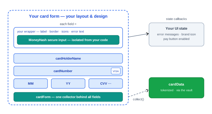
The five fields
Five secure fields make a card form - card number, card holder name, expiry month, expiry year, and CVV - and all five must be rendered for collect() to succeed (the SDK throws a descriptive error naming any missing field). Each one below shows the field on every platform; the names differ slightly per SDK, so copy from the tab you're building on.
Card number
Formats and groups the digits as the customer types, enforces the 19-digit maximum, runs the Luhn check, and detects the brand - this is also where your brand icon slot goes.
const cardNumber = elements.create({
  elementType: "cardNumber",
  elementOptions: { selector: "#cardNumber", placeholder: "Card number" },
});
cardNumber.mount();

cardNumber.on("cardNumberChange", ({ brandIconUrl }) => setBrandIcon(brandIconUrl));
// state handler registered on the builder:
// .setCardNumberField { state in self.numberState = state }
SecureTextField(cardFormCollector: cardForm, type: .cardNumber) {
Text("Card number")
}SecureTextField(
cardForm = cardForm,
type = FieldType.CARD_NUMBER,
label = { Text("Card number") },
keyboardOptions = KeyboardOptions(keyboardType = KeyboardType.Number),
trailingIcon = { BrandIcon(brandState) },
)SecureTextField(
cardForm: cardForm,
type: CardFieldType.cardNumber,
label: "Card number",
errorMessage: _numberError,
trailingIcon: _brandIcon(),
),<SecureTextField
name="cardNumber"
placeholder="#### #### #### ####"
onCardBrandChange={(info) => setBrandIconUrl(info?.brandIconUrl)}
/>Card holder name
The one field you control: mark it required (and add regex rules) through configuration, leave it optional, or - on the web - pre-fill it with a merchant-provided value instead of rendering an input at all.
// As an input the customer types into — add any number of custom
// RegExp validations, e.g. allow only English characters:
elements.create({
elementType: "cardHolderName",
elementOptions: {
selector: "#card-holder-name",
validation: {
required: true,
},
// pass any number of custom validations
customValidation: {
englishOnly: "/^[A-Za-z ]+$/",
},
},
}).mount();
// Or pre-filled from your data — no input rendered
elements.create({ elementType: "cardHolderName", value: "AHMED SALEM" });// Mark it required + add regex rules on the collector's configuration:
let cardForm = CardFormBuilder()
.setConfiguration(CardFormConfiguration(
isCardHolderNameRequired: true,
cardHolderValidations: [
"Name must contain only English letters and spaces": "^[A-Za-z ]+$"
],
enableCardNumberValidation: true
))
// … field handlers …
.build()
SecureTextField(cardFormCollector: cardForm, type: .cardHolderName) {
Text("Name on card")
}// Mark it required + add regex rules on the collector's configuration:
val cardForm = CardFormBuilder()
.setConfiguration(CardFormConfiguration(
isCardHolderNameRequired = true,
cardHolderValidations = mapOf(
"Name must contain only English letters and spaces" to "^[A-Za-z ]+$"
),
enableCardNumberValidation = true
))
// … field listeners …
.build()
SecureTextField(
cardForm = cardForm,
type = FieldType.CARD_HOLDER_NAME,
label = { Text("Name on card") },
)// Mark it required + add regex rules on the collector's configuration:
final cardForm = CardFormBuilder()
.setConfiguration(CardFormConfiguration(
isCardHolderNameRequired: true,
cardHolderValidations: {
"Name must contain only English letters and spaces": r"^[A-Za-z ]+$",
},
enableCardNumberValidation: true,
))
// … field handlers …
.build();
SecureTextField(
cardForm: cardForm,
type: CardFieldType.cardHolderName,
label: "Name on card",
errorMessage: _nameError,
),// Mark it required + add regex rules on the form's configuration prop:
<SecureCardForm
ref={cardFormRef}
configuration={{
isCardHolderNameRequired: true,
cardHolderValidations: {
"Name must contain only English letters and spaces": "^[A-Za-z ]+$",
},
}}>
<SecureTextField name="cardHolderName" placeholder="Name on card" />
</SecureCardForm>Expiry month & year
Two separate fields - put them side by side and auto-advance from month to year (see the focus section below). Month validates 01–12; the pair must be in the future.
["cardExpiryMonth", "cardExpiryYear"].forEach((elementType) =>
elements
.create({ elementType, elementOptions: { selector: "#" + elementType } })
.mount()
);HStack {
SecureTextField(cardFormCollector: cardForm, type: .expireMonth) { Text("MM") }
SecureTextField(cardFormCollector: cardForm, type: .expireYear) { Text("YY") }
}Row {
SecureTextField(cardForm = cardForm, type = FieldType.EXPIRE_MONTH, label = { Text("MM") })
SecureTextField(cardForm = cardForm, type = FieldType.EXPIRE_YEAR, label = { Text("YY") })
}Row(children: [
Expanded(child: SecureTextField(cardForm: cardForm, type: CardFieldType.expiryMonth, placeholder: "MM")),
Expanded(child: SecureTextField(cardForm: cardForm, type: CardFieldType.expiryYear, placeholder: "YY")),
]),<SecureTextField ref={monthRef} name="expiryMonth" placeholder="MM"
onChange={({ isValid }) => { if (isValid) yearRef.current?.focus(); }} />
<SecureTextField ref={yearRef} name="expiryYear" placeholder="YY" />CVV
Always mask it (maskCvv) - the digits render as bullets without changing the collected value. The expected length is brand-aware: when the detected brand becomes Amex, the field re-validates against 4 digits automatically.
elements.create({
elementType: "cardCvv",
elementOptions: { selector: "#cardCvv", placeholder: "···" },
}).mount();SecureTextField(cardFormCollector: cardForm, type: .cvv, maskCvv: true) {
Text("CVV")
}SecureTextField(
cardForm = cardForm,
type = FieldType.CVV,
maskCvv = true,
label = { Text("CVV") },
)SecureTextField(
cardForm: cardForm,
type: CardFieldType.cvv,
maskCvv: true,
placeholder: "***",
),<SecureTextField name="cvv" maskCvv placeholder="***" />On React Native, each field also sets the right autoComplete hint automatically (cc-number, cc-exp-month, cc-exp-year, cc-csc), so platform autofill works out of the box.
The complete form
One pattern on every platform: create the collector (with optional configuration and per-field state listeners), render the five fields inside your own layout, and keep a reference to the collector for collect().
const elements = moneyHash.elements({
styles: {
color: { base: "#1f2933", error: "#dc2626" },
backgroundColor: "#ffffff",
placeholderColor: "#9aa5b1",
fontSize: "15px",
height: "44px",
padding: "0 12px",
},
classes: { focus: "field--focus", error: "field--error" },
});
// Create and mount each field into your own containers
["cardHolderName", "cardNumber", "cardExpiryMonth", "cardExpiryYear", "cardCvv"]
.forEach((elementType) => {
elements
.create({ elementType, elementOptions: { selector: "#" + elementType } })
.mount();
});
// Form-level validity — drive your Pay button
elements.on("validityChange", (isFormValid) => setPayEnabled(isFormValid));
// Later: collect the tokenized card data
const cardData = await moneyHash.cardForm.collect();let cardForm = CardFormBuilder()
.setConfiguration(CardFormConfiguration(
isCardHolderNameRequired: true,
cardHolderValidations: [
"Name must contain only letters and spaces": "^[a-zA-Z\\s]+$"
],
enableCardNumberValidation: true // Luhn check
))
.setCardNumberField { state in self.cardNumberState = state }
.setCVVField { state in self.cvvState = state }
.setExpireMonthField { state in self.monthState = state }
.setExpireYearField { state in self.yearState = state }
.setCardHolderNameField { state in self.nameState = state }
.setCardBrandChangeHandler { brand in self.brand = brand }
.build()
// Compose the fields into your own SwiftUI layout
SecureTextField(cardFormCollector: cardForm, type: .cardNumber) { Text("Card number") }
HStack {
SecureTextField(cardFormCollector: cardForm, type: .expireMonth) { Text("MM") }
SecureTextField(cardFormCollector: cardForm, type: .expireYear) { Text("YY") }
SecureTextField(cardFormCollector: cardForm, type: .cvv, maskCvv: true) { Text("CVV") }
}
SecureTextField(cardFormCollector: cardForm, type: .cardHolderName) { Text("Name on card") }
// Later: collect the tokenized card data
let cardData = try await cardForm.collect()val cardForm = CardFormBuilder()
.setConfiguration(CardFormConfiguration(
isCardHolderNameRequired = true,
cardHolderValidations = mapOf(
"Name must contain only letters and spaces" to "^[a-zA-Z\\s]+$"
),
enableCardNumberValidation = true // Luhn check
))
.setCardNumberField { state -> cardNumberState = state }
.setCVVField { state -> cvvState = state }
.setExpireMonthField { state -> monthState = state }
.setExpireYearField { state -> yearState = state }
.setCardHolderNameField { state -> nameState = state }
.setCardBrandChangeListener { brand -> brandState = brand }
.build()
// Compose the fields into your own layout — standard Material 3 params
SecureTextField(
    cardForm = cardForm,
    type = FieldType.CARD_NUMBER,
    label = { Text("Card number") },
    keyboardOptions = KeyboardOptions(keyboardType = KeyboardType.Number),
    trailingIcon = { BrandIcon(brandState) },
)
Row {
SecureTextField(cardForm = cardForm, type = FieldType.EXPIRE_MONTH, label = { Text("MM") })
SecureTextField(cardForm = cardForm, type = FieldType.EXPIRE_YEAR, label = { Text("YY") })
SecureTextField(cardForm = cardForm, type = FieldType.CVV, maskCvv = true, label = { Text("CVV") })
}
// Later: collect the tokenized card data
val cardData = cardForm.collect()final cardForm = CardFormBuilder()
.setConfiguration(CardFormConfiguration(
isCardHolderNameRequired: true,
cardHolderValidations: {
"Name must contain only letters and spaces": r"^[a-zA-Z\s]+$",
},
enableCardNumberValidation: true, // Luhn check
))
.setCardNumberField((state) => setState(() => _numberError = state?.errorMessage))
.setCVVField((state) => setState(() => _cvvError = state?.errorMessage))
.setExpiryMonthField((state) => setState(() => _monthError = state?.errorMessage))
.setExpiryYearField((state) => setState(() => _yearError = state?.errorMessage))
.setCardHolderNameField((state) => setState(() => _nameError = state?.errorMessage))
.setCardBrandChangeListener((brand) => setState(() => _brand = brand))
.build();
// Compose the fields into your own widget tree
SecureTextField(
  cardForm: cardForm,
  type: CardFieldType.cardNumber,
  label: "Card number",
  errorMessage: _numberError,
  trailingIcon: _brandIcon(),
),
Row(children: [
Expanded(child: SecureTextField(cardForm: cardForm, type: CardFieldType.expiryMonth, placeholder: "MM")),
Expanded(child: SecureTextField(cardForm: cardForm, type: CardFieldType.expiryYear, placeholder: "YY")),
Expanded(child: SecureTextField(cardForm: cardForm, type: CardFieldType.cvv, maskCvv: true, placeholder: "***")),
]),
// Later: collect the tokenized card data
final cardData = await cardForm.collect();const { cardFormRef, collect, isValid } = useSecureCardForm();
<SecureCardForm
ref={cardFormRef}
onFormValidityChange={(valid) => setPayEnabled(valid)}
configuration={{
isCardHolderNameRequired: true,
cardHolderValidations: {
"Name must contain only letters and spaces": "^[a-zA-Z\\s]+$",
},
enableCardNumberValidation: true, // Luhn check
}}>
<SecureTextField
name="cardNumber"
placeholder="#### #### #### ####"
style={({ isFocused, isError }) => [
styles.input,
isFocused && styles.inputFocused,
isError && styles.inputError,
]}
onCardBrandChange={(info) => setBrandIconUrl(info?.brandIconUrl)}
onErrorChange={({ errorMessage }) => setNumberError(errorMessage)}
/>
{/* … expiryMonth · expiryYear · cvv (maskCvv) · cardHolderName */}
</SecureCardForm>
// Later: collect the tokenized card data
const cardData = await collect();Configuration & validation
The collector validates inside the isolated fields on every keystroke and reports the result to you - you never implement card validation yourself, you only render its output.
Configuration (CardFormConfiguration on mobile; per-element options on the web):
| Option | Default | What it does |
|---|---|---|
isCardHolderNameRequired (web: validation.required on the cardHolderName element) | false | Makes the name field mandatory for form validity. |
cardHolderValidations (web: customValidation) | - | Custom RegExp rules for the name - pass as many as you need. Mobile takes error message → regex (the failing rule’s message becomes errorMessage); the web takes rule name → RegExp, e.g. englishOnly: "/^[A-Za-z ]+$/" to allow only English characters. |
enableCardNumberValidation | true | Runs the Luhn checksum on the card number in addition to length/format checks. |
What the built-in validation covers: card number formatting and grouping with a 19-digit maximum plus the Luhn check; expiry month 01–12 and expiry date in the future; CVV length per brand - when the detected brand changes to Amex the CVV field re-validates against 4 digits automatically and re-emits its state.
What you receive - every field reports a state object (CardInputFieldState / CardFieldState) on each change: isValid, errorMessage (null when valid), length, and isOnFocused. On the web the equivalents are the changeInput event ({ isValid, length }) and the error event ({ isValid, error }). Note the state never contains the typed value - only metadata about it.
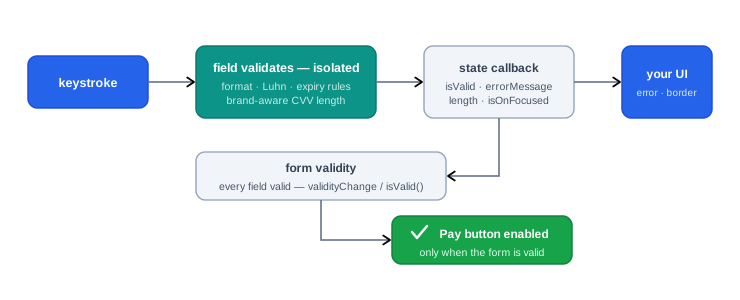
Show field errors
Render errorMessage from the field's state - it is null while the field is valid, and localized to the failure (format, Luhn, expired date, regex rule). Reveal errors on the error callback or on blur, not on every keystroke.
cardNumber.on("error", ({ isValid, error }) => {
  setNumberError(isValid ? null : error);
});
.setCardNumberField { state in
self.numberError = state.errorMessage // nil while valid
}.setCardNumberField { state ->
numberError = state.errorMessage // null while valid
isNumberError = !state.isValid && state.length > 0
}.setCardNumberField((state) {
setState(() => _numberError = state?.errorMessage); // null while valid
})<SecureTextField
name="cardNumber"
onErrorChange={({ errorMessage }) => setNumberError(errorMessage)}
/>Enable the Pay button
Always gate the Pay button (and collect()) on the form-level check - never by AND-ing the per-field states yourself. The per-field flags can all be true while the form is still invalid, because some rules are cross-field: with today in August 2026, month 04 is a valid month and year 26 is a valid year - each field reports valid on its own - but April 2026 is in the past, and only the form-level validation of the expiry pair catches it.
// Form-level validity, computed by the SDK:
elements.on("validityChange", (isFormValid) => setPayEnabled(isFormValid));
// Form-level check — validates the whole form, incl. the expiry pair:
if cardForm.isValid {
enablePayButton()
}// Form-level check — validates the whole form, incl. the expiry pair:
val formState = cardForm.validate() // CardFormState
if (formState.isValid) enablePayButton()// Form-level check — validates the whole form, incl. the expiry pair:
final isFormValid = await cardForm.isValid();// Form-level validity from the hook (or onFormValidityChange):
const { isValid } = useSecureCardForm(); // re-renders on validity changeCard brand detection
As soon as the first six digits are typed, the card number field emits a brand event with the detected brand (visa, mastercard, mada, troy, amex, …), a ready-to-use brandIconUrl, and the first 6/8 digits. Use it to show the brand icon inside your field chrome, and let the CVV adapt automatically. At 8 digits you can optionally fire a BIN lookup for issuer, card type, and country.
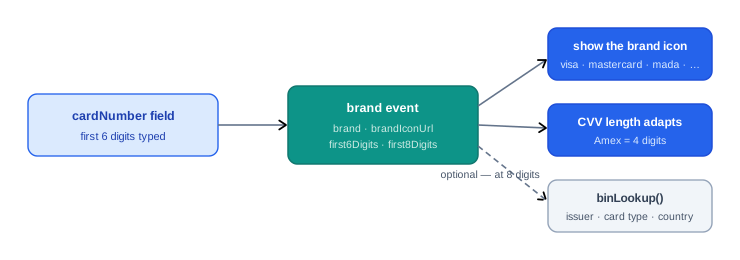
cardNumberField.on("cardNumberChange", ({ brand, brandIconUrl, first8Digits }) => {
  setBrandIcon(brandIconUrl);
  if (first8Digits) moneyHash.cardForm.binLookup().then(handleLookup);
});
CardFormBuilder()
.setCardBrandChangeHandler { brand in
self.brandIconUrl = brand.brandIconUrl
}CardFormBuilder()
.setCardBrandChangeListener { brand ->
brandIconUrl = brand.brandIconUrl
}CardFormBuilder()
.setCardBrandChangeListener((brand) {
setState(() => _brandIconUrl = brand?.brandIconUrl);
})<SecureTextField
name="cardNumber"
onCardBrandChange={(info) => setBrandIconUrl(info?.brandIconUrl)}
/>Styling & theming
Your wrapper - label, border, background, error text, icons - is plain UI on every platform, so most theming needs no SDK involvement. What the SDK styles is the input surface itself. Here is every styling option per platform:
// Shared styles for all fields — every option:
const elements = moneyHash.elements({
  styles: {
    color: "<text-color>", // or { base: "<text-color>", error: "<text-color>" }
    backgroundColor: "<bg-color>",
    placeholderColor: "<placeholder-color>",
    fontSize: "<font-size>",
    fontFamily: "<font-family>",
    fontStyle: "normal", // "normal" | "italic" | "oblique"
    fontWeight: "<font-weight>",
    padding: "<padding>",
    height: "<height>",
    direction: "ltr", // "ltr" | "rtl"
    textAlign: "left", // "left" | "center" | "right"
  },
  classes: {
    // your CSS classes — applied to the field container on focus/error
    focus: "border border-blue-600",
    error: "border border-red-500",
  },
  fontSourceCss: "<absolute URL to a CSS file with @font-face definitions>",
});

// Per-element override — same options, applied to one field only:
const cardHolderNameEl = elements.create({
  elementType: "cardHolderName",
  elementOptions: {
    selector: "#card-holder-name",
    placeholder: "Enter card holder name...",
    styles: {
      color: "red",
      backgroundColor: "black",
      placeholderColor: "#ccc",
      height: "40px",
      fontSize: "14px",
      padding: "8px",
      direction: "rtl",
    },
    classes: {
      focus: "border border-blue-600",
      error: "border border-red-500",
    },
  },
});
// The field is a SwiftUI view — style it (and your wrapper) with
// standard modifiers; the placeholder is any view you build:
SecureTextField(cardFormCollector: cardForm, type: .cardNumber) {
Text("Card number")
.foregroundColor(.secondary)
.font(.system(size: 15))
}
.font(.system(size: 15, weight: .medium))
.foregroundColor(.primary)
.padding(12)
.background(
RoundedRectangle(cornerRadius: 12).fill(Color(.systemBackground))
)
.overlay(
RoundedRectangle(cornerRadius: 12)
.stroke(
isNumberActive ? Color.accentColor :
numberError != nil ? Color.red : Color(.separator)
)
)// A Material 3 TextField — every visual parameter:
SecureTextField(
modifier = Modifier.fillMaxWidth(),
cardForm = cardForm,
type = FieldType.CARD_NUMBER,
enabled = true,
readOnly = false,
textStyle = MaterialTheme.typography.bodyLarge,
placeholder = { Text("#### #### #### ####") },
label = { Text("Card number") },
leadingIcon = { Icon(Icons.Default.CreditCard, contentDescription = null) },
trailingIcon = { BrandIcon(brandState) },
prefix = { /* composable */ },
suffix = { /* composable */ },
supportingText = { Text("As printed on the card") },
isError = numberError != null,
maskCvv = false, // CVV field only
keyboardOptions = KeyboardOptions(keyboardType = KeyboardType.Number),
keyboardActions = KeyboardActions(onNext = { /* … */ }),
shape = RoundedCornerShape(12.dp),
colors = TextFieldDefaults.colors(
focusedIndicatorColor = MaterialTheme.colorScheme.primary,
errorIndicatorColor = MaterialTheme.colorScheme.error,
),
)// Every visual parameter of the widget:
SecureTextField(
cardForm: cardForm,
type: CardFieldType.cardNumber,
enabled: true,
readOnly: false,
textStyle: Theme.of(context).textTheme.bodyLarge,
label: "Card number",
placeholder: "#### #### #### ####",
leadingIcon: const Icon(Icons.credit_card),
trailingIcon: _brandIcon(),
supportingText: "As printed on the card",
errorMessage: _numberError,
keyboardType: TextInputType.number,
textInputAction: TextInputAction.next,
focusNode: _numberFocus,
maskCvv: false, // CVV field only
// or take full control of the visuals:
decoration: InputDecoration(
border: OutlineInputBorder(borderRadius: BorderRadius.circular(12)),
filled: true,
),
),<SecureTextField
name="cardNumber"
placeholder="#### #### #### ####"
placeholderTextColor="#9aa5b1"
// style is a function of the field's live state:
style={({ isFocused, isError }) => [
{
height: 44,
borderWidth: 1,
borderRadius: 12,
paddingHorizontal: 12,
fontSize: 15,
color: "#1f2933",
borderColor: "#e3e8ee",
backgroundColor: "#ffffff",
},
isFocused && { borderColor: "#0d9488" },
isError && { borderColor: "#dc2626" },
]}
// every other TextInput prop passes through:
// keyboardType · autoFocus · editable · selectionColor · …
/>Custom fonts on the web load through fontSourceCss - an absolute URL to a CSS file with @font-face definitions (e.g. Google Fonts) - because the inputs render inside MoneyHash-hosted iframes that can't see your page's fonts. On mobile the fields use your app's fonts like any other native view.
Language, RTL & LTR
Localizing the form is two separate switches - the language (what the SDK's validation error messages say) and the direction (how the inputs lay out). Every SDK ships Arabic, English, and French; set the locale and the field error messages come back translated, so your Arabic checkout shows Arabic errors with zero work on your side.
On direction, the platforms differ in one important way: mobile fields are native views, so they follow your app's layout direction automatically - but on the web the inputs live inside iframes and do not inherit your page's dir="rtl", so you must flip them explicitly through the element styles.
Here is a full Arabic setup on every platform:
// 1 · Language — validation error messages come back in Arabic
const moneyHash = new MoneyHash({
  type: "payment",
  publicApiKey: "<YOUR_PUBLIC_API_KEY>",
  locale: "ar", // "ar" · "en" · "fr"
});
// or switch at runtime:
await moneyHash.setLocale("ar");

// 2 · Direction — the iframes don't inherit your page's dir="rtl",
//     so flip the inputs explicitly:
const elements = moneyHash.elements({
  styles: {
    direction: "rtl",
    textAlign: "right",
  },
});
// Language — validation error messages come back in Arabic
moneyHash.setLocale(.arabic) // .arabic · .english · .french
// Direction — nothing to do: the fields are native views and follow
// the app's layout direction (Arabic locale flips them automatically).// Language — validation error messages come back in Arabic
moneyHash.setLocale(SDKLocale.ARABIC) // ARABIC · ENGLISH · FRENCH
// Direction — nothing to do: the fields are Compose TextFields and
// follow the app's layout direction automatically.// Language — validation error messages come back in Arabic
moneyHash.setLocale(Language.arabic); // arabic · english · french
// Direction — nothing to do: the fields follow your app's
// Directionality (e.g. an RTL MaterialApp locale) automatically.// Language — validation error messages come back in Arabic
moneyHash.setLocale(Language.ARABIC); // ARABIC · ENGLISH · FRENCH
// Direction — nothing to do: the fields follow the app's
// I18nManager layout direction automatically.Two rules of thumb for Arabic layouts:
- Keep the digit fields LTR. Card number, expiry, and CVV are digit sequences that read left-to-right everywhere, including Arabic interfaces - apply RTL to your labels, your layout, and the card holder name, not to the digits.
- The card holder name accepts Arabic. Arabic characters and Arabic numerals are valid input - just make sure any
customValidation/cardHolderValidationsregex you add doesn't accidentally reject them (anenglishOnlyrule and an Arabic name can't both win).
Focus & keyboard handling
Card entry lives or dies on keyboard flow: numeric keyboards on the digit fields, and focus that advances by itself when a field is complete. Each platform does this with its own idiom:
// Auto-advance when a field becomes valid, submit from the CVV
cardExpiryMonth.on("changeInput", ({ isValid }) => {
  if (isValid) cardExpiryYear.focus();
});
cardExpiryYear.on("changeInput", ({ isValid }) => {
  if (isValid) cardCvv.focus();
});
cardCvv.on("key:Enter", () => payIfFormValid());

// Also available on every field: .focus() · .blur() · .clear()
// The fields manage focus internally and report it back through the
// state handlers — use state.isOnFocused to style the active field's
// wrapper. Arrange the fields in visual order; the system keyboard
// handles movement between them.
.setExpireMonthField { state in
self.isMonthActive = state.isOnFocused
}// Numeric keyboard + IME "next" that moves focus forward
SecureTextField(
cardForm = cardForm,
type = FieldType.EXPIRE_MONTH,
label = { Text("MM") },
keyboardOptions = KeyboardOptions(
keyboardType = KeyboardType.Number,
imeAction = ImeAction.Next,
),
keyboardActions = KeyboardActions(
onNext = { focusManager.moveFocus(FocusDirection.Next) },
),
)// Own focus nodes + IME action, advance in the field's state handler
SecureTextField(
cardForm: cardForm,
type: CardFieldType.expiryMonth,
focusNode: _monthFocus,
textInputAction: TextInputAction.next,
),
// in the builder:
// .setExpiryMonthField((s) {
// if (s?.isValid == true) _yearFocus.requestFocus();
// })// Refs expose .focus() — chain fields as they become valid
<SecureTextField ref={monthRef} name="expiryMonth" placeholder="MM"
onChange={({ isValid }) => { if (isValid) yearRef.current?.focus(); }} />
<SecureTextField ref={yearRef} name="expiryYear" placeholder="YY"
onChange={({ isValid }) => { if (isValid) cvvRef.current?.focus(); }} />
<SecureTextField ref={cvvRef} name="cvv" maskCvv placeholder="***" />Best practices
- Build the collector before rendering any field. The fields resolve their view models from the collector - accessing a field before the builder ran throws on mobile.
- One collector per screen. Create it once (view model / state holder), not on every render.
- Drive the Pay button from
cardForm.isValid/ form-level validity, never from your own field bookkeeping - cross-field rules like an expiry pair in the past (month04+ year26are each valid alone) are only caught by the form-level check, along with brand-aware CVV and Luhn. - Show errors on blur or on the
errorevent, not on every keystroke. A card number is invalid for its first 15 characters; flashing red while typing punishes normal input. - Auto-advance focus between expiry month, year, and CVV - and show numeric keyboards on mobile.
- Put the brand icon inside the card number field (trailing icon slot) the moment the brand event fires; fall back to a neutral icon for
unknown. - Mask the CVV (
maskCvv: true) and never persist any field state object - treat the whole form as ephemeral. - Call
collect()once per submission, on tap of Pay - not eagerly - and pass the returnedcardDatastraight topay()orcreateCardToken(). - Test an RTL locale and an Amex card before shipping: the two most common layout and validation surprises.
Updated about 1 month ago